


Robert Hughes once described the weekly paste-up night at The East Village Other as “a Dada experience.” The year was 1970 and while none of us who were toiling into the wee hours of the morning at one of America’s oldest underground papers (founded in 1965) knew what he was talking about, we nevertheless assumed that to get Time’s then newly appointed art critic to spend some of his first weeknights in America with us, we were doing something weird and perhaps even important. “Dada was the German anti-art political-art movement of the 1920s,” he explained in his cool Australian accent. “And this is the closest thing I’ve come to seeing it recreated today. I’m really grateful for the chance to be here.”
Yet he needn’t have been so grateful. He was as welcome as any other artist, writer, musician, hanger-on and at that moment, detective Frank Serpico, the most famous whistle-blowing cop in America, was stationed at the local Ninth Precinct and would came around periodically in his various undercover costumes to schmooze with the EVO staffers. Paste-up night was open to anybody who drifted up to the dark loft above Bill Graham’s Fillmore East, a former Loews Theater turned rock palace on Second Avenue and Sixth Street, just next door to Ratner’s famous dairy restaurant, in a neighborhood that in the Thirties was the heart of New York’s Yiddish Theater. At that time it was the East Coast hippie capital.
Beginning at seven or eight o’clock at night and lasting until dawn, the regular and transient layout staff took the jumble of counterculture journalism and anti-establishment diatribe that was the paper’s editorial meat and threw it helter skelter onto layouts that were pretty anarchic. Anyone could join in whether they had graphic design experience or not, yet many of the gadfly layout artists were too stoned to complete their pages which were finished on the long subway ride to the printer deep inside Brooklyn.
 From “Rebel Visions: The Underground Comix Revolution 1963-1975” by Patrick Rosenkranz.
EVO’s paste-up was the closest thing I had ever come to a tribal ritual. Every Thursday night for well over a year I joined the others in the group encounter that was part makeup and part make-out session. I had done all-nighters before but none were as fever-pitched or as drug stimulated as EVO. While I harbored superstitions about drugs and never touched the stuff myself, the joints and acid tabs were the payment for a good night’s work. Someone routinely emerged from the editor’s office around 8:30 p.m. with a shoebox full of the stuff, as well as with the night’s layout assignments, which included at least three pages of “intimate” classifieds. The layout crew would help themselves to grass (the acid was saved until after the session was over) and manuscripts, find their tables, select their decorative ruling tapes and transfer type sheets, and settle down to “design” pages.
The editor’s office, where everyone congregated at one time or another during the night, was a dimly lit cubicle papered with manuscripts, clippings, proofs and other underground papers. It was also where the editor, who suffered from a degenerative nerve disease, spent most of his time schmoozing with anywhere from ten to fifteen habitués while snorting his drug of choice, cocaine, which gave him cavernous nostrils, the focal point of his yellow-tinged, hollowed-out face. Beginning early every Thursday morning, however, this was also where — in solitude — he would read the week’s copy and as diligently as possible put the finishing touches on manuscripts submitted by his staff of writers and columnists. Yet his mastery of the blue pencil was minimal at best and by any measure the manuscripts remained unfinished even after editing. In fact, the only way to insure clean copy, if one really cared about such trifles, was to edit it oneself.
Way back in 1965, as a fifteen-year-old, I was an early EVOtee. I had stumbled upon one of the first issues at a newsstand. The cover, which I remember vividly, had a photo collage of a serpent emerging from battle fatigues worn by America’s commanding general in Vietnam, William Westmoreland. Haunting is not a strong enough word to describe the impact that this had on a teen just a year or two out of Valley Forge Military Academy, where, surprisingly, I had learned about the military impossibility of winning the war. EVO was my introduction to the emerging counterculture and I savored each issue, as an adolescent boy would covet his contraband copy of Playboy. I even made a pilgrimage to EVO’s original storefront office on Tompkins Square Park to inquire whether they could use volunteer labor. I was met at the door by one of the founding editors, Walter Bowart, who said, “Come back kid, when you’re not jail bait.” Though my pride was hurt, I continued to venture into the East Village after school in the hope that I would earn my stripes as a hippie first-class and then, despite being under-age, be invited back into EVO’s inner sanctum.
 From “Rebel Visions: The Underground Comix Revolution 1963-1975” by Patrick Rosenkranz.
The road to EVO was long and circuitous. Before I could be invited in I had to make myself valuable. So I turned to making cartoons of angst-ridden little men with long hair and mustaches without genitalia in situations that were religious in nature but with a touch of Jules Feiffer’s irony. Feiffer was my hero but the inspiration for this subject matter came from the disciplinary dean at my prep school, who upon learning from his stooges that I was growing my hair longer than the school regulations allowed proceeded to have my head shaved by a sadistic YMCA barber.
I eventually left prep school for a progressive school where I was allowed to have long hair and a clip-on earring and began hawking my artwork to the other New York undergrounds that had begun around 1967. Finding a receptive outlet at the New York Avatar (the journal of the Boston guru and jug band musician, Mel Lyman). I was taken under the wing of its art director, a gaunt, frightening demonic character who taught me the virtue of fanning out lines of type and other underground layout tricks. The Avatar was ostensibly concerned with the creepy machinations of Lyman’s conscious and subconscious and its effect on the world and my drawings of Christ-like characters fit nicely into his agenda.
Later I found a temporary haven at the RAT, an SDS-oriented tabloid. I produced two comic strips for RAT that dealt, rather simplistically with issues of racism and inequality. RAT saw in me a future Ron Cobb, the brilliant political cartoonist of the Los Angeles Free Press, but after publishing them I couldn’t come up with any other socially satiric strips and was dropped immediately. Finally, I lucked into a comparatively full-time job as a paste-up artist, cartoonist and two weeks later, the art director of the New York Free Press.
At the Free Press I learned the rights and wrongs of newspaper design. The Freep was rather conventional. Its columns were standard; the type was usually justified, unless of course the IBM MTST magnetic typesetting machine was on the fritz. EVO, on the other hand, was resolutely formless. While it had an anchored editorial page the features and columns were not constricted by either aesthetic or functional rules. By the time I arrived at EVO five years after its founding and two after its real heyday, the layout staff, of between five and ten, on any given Thursday were all erstwhile amateurs without a clue how to create consistent design even if they wanted to. I, on the other hand, was now a two-year veteran learned in the ways of the grid, central axis composition and knew the right way to refer to a magazine (or newspaper), as a “book.”
 From “Rebel Visions: The Underground Comix Revolution 1963-1975” by Patrick Rosenkranz.
The first couple of weeks on the job I created islands of elegance in a sea of ugliness. But I became bored, indeed, envious of the naïfs around me. The biggest influence in those sessions, however, was watching veteran, Fred Mogubgub draw obsessively intricate designs for covers (including the masthead) and inside pages that were often printed in a split fountain, going from unreadable yellow to brilliant orange to faint green. Mogubgub was a pioneer commercial animator, whose quirky, detailed, comic style changed the look of animated commercials in the early 1960s. When I was a kid I marveled at the hilarious 7up bottles that literally can-caned across my TV screen.
I began to play with copy by blowing up words, laying down heavy ruling tape over or under copy blocks to emphasize key passages. I integrated various found and clipped images around text and headlines to further invigorate the page. Soon my EVO layouts were as ugly (read as vibrant) as the others and still had some semblance of text that could be read. The pages had become textures. I likened it to literally letting my hair down, which I wore in a tight ponytail.
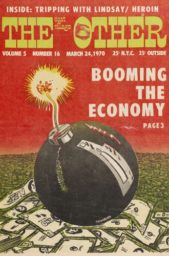
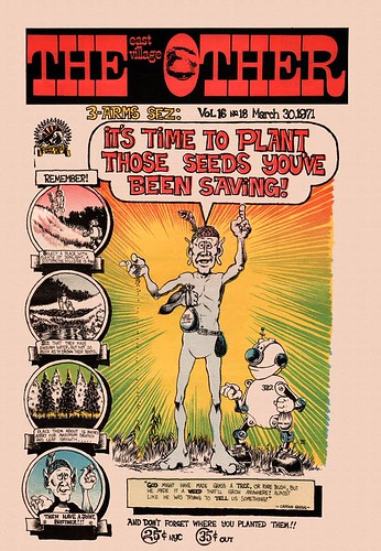
By 1972 EVO’s circulation, which is reported to have once been around 75,000 nationwide, had plummeted to five or six thousand and most of that was for the sex ads and classifieds that it took to stay afloat. It was also consistent with the demise of the Underground Press in general, which either evolved into mainstream alternative journalism or just died. Some of EVO’s elite went on to the SoHo News, which sought respectability but never attained the circulation figures. Other EVOtees went on to other publishing ventures, and some simply disappeared. The issues of EVO printed on cheap newsprint are hard to find these days, either because they were thrown away or turned to dust. The few that remain in the hands of collectors, however, represent a remarkable period of counterculture publishing, naïf design and youthful exuberance that marked one of the democratic periods in American history, when the means of cheap communication was in the hands of many. For me, I learned how much fun it was to make expressive design. While I have continued a rather reserved course with my art direction, the EVO experience was not a youthful fling but a point of departure.
Thanks to Robert Hughes I had begun to read about Dada, and in that spirit I decided that every designer needed a Dada, if only to clear one’s head of the rules and regulations. EVO cleared my head then, and I could sure use it again forty years later.
This essay originally appeared on Design Observer on Dec. 3, 2008.
Steven Heller Steven Heller wears many hats (in addition to the New York Yankees): For 33 years he was an art director at the New York Times, originally on the Op-Ed Page and for almost 30 of those years with The New York Times Book Review. Currently, he is co-chair of the MFA Designer as Author Department, Special Consultant to the President of SVA for New Programs, and writes the Visuals column for The New York Times Book Review. His Website is HellerBooks.com
For more on “Blowing Minds: The East Village Other, the Rise of Underground Comix and the Alternative Press, 1965-72,” read about the exhibition here, and read more from EVO’s editors, writers, artists, and associates here.
